Redesigning performer search to accelerate an integral part of the casting process for TV, theatre and film
5 min read
Client: Spotlight
Sector: Performing Arts
Role: Product Designer
Duration: 4 Months
Completed: 2019
Overview:
With over 70,000 performers on their books, Spotlight is known across Europe as the most prestigious casting platform. Working within the product team, I lead the design of a new performer search. My role involved strategy, research, discovery, workshop facilitation, information architecture, prototyping, wireframes, user testing and UX/UI design.
The challenge
Search and filtering are fundamental parts of Spotlight’s online experience. Many of Spotlight’s services are provided via software products which utilise search and filtering functionalities.
The primary touchpoint to address was Spotlight’s performer search. Various issues existed with the product, such as being non-responsive across devices, with dated UI patterns and unstructured historical data.
Project goals
Performer search took priority within a roadmap of important journeys and touchpoints to improve as part of redesigning Spotlight’s platform.
Goals included:
Delivering a solution which positions Spotlight to expand internationally by supporting multiple languages and enables customers to find jobs, agents and performers within countries, regions and cities.
Improving the ability for users to browse performer profiles and jobs.
Giving users more choice and control over jobs and performers they see.
Supporting multiple membership tiers and future disciplines.
Future proofing Spotlight’s platform.
Building the foundations of a design system.
Problems to address
Statements included:
“Performer search has a historical hangover where performers are separated based on the directories that we used to print, which no longer makes sense.”
“Some of the search criteria is unlikely to be used very often as these are not easily found — we surface skills for selection, even when there may not be any results.”
“Searching for unstructured data causes confusion in results, as it should be clear to the user why the results have been shown.”
Spotlight’s non-responsive performer search.
Defining an approach
I set out to follow a design thinking process, to facilitate the ambition to fulfil the needs of Spotlight’s various user types — undertaking a discovery phase to empathise and then define, followed by ideating and testing prototype solutions.
Understanding the problem
Reviewing business goals, product tenants and problem statements provided the starting point. I then conducted extensive research through workshops, data analysis, surveys, interviews, competitor analysis and focus groups.
Utilising the experts
Spotlight’s membership team support performers, agents and casting directors, and have specialised in those roles previously themselves. Their knowledge and their connections were key to tap into by initiating the right conversations.
Meeting the industry players
Performers, agents and casting directors are all important personas of the casting process. Understanding their ways of working, any frustrations they had with the platform and testing prototypes with them would be essential.
Research and discovery
To kick off, I wanted to understand the platform and architecture through heuristic analysis. Here I discovered the opportunity to streamline searching for performers into one location, and proposing to use the same structure for other sections.
I continued by analysing research documentation accessible online, breaking down search and filtering into checkpoints. This would provide a solid foundation of reference criteria, covering edges cases and technical logic.
Mapping the platform’s touchpoints and benchmarking best practice product attributes as reference checkpoints.
Competitive analysis
Researching competitors and other best practice references gave us good insights into common patterns and successful UX patterns. References included competitors, other casting platforms, ecommerce sites, talent directories and job sites.
Key competitor insights:
Performers shown by default on search landing.
Grid view results as default view.
Primary filters emphasised.
Advanced filters de-emphasised.
Performer card actions included:
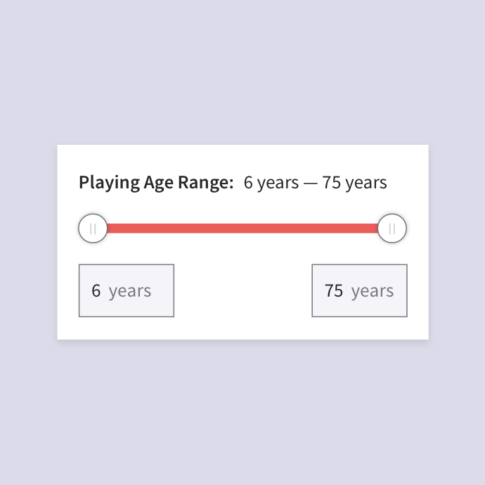
contact, shortlist, share, tag, add to folder.Slider radius selections for numerical filter values.
Filter data analysis
Analysing Spotlight’s existing performer search quantitative data helped to better understand how casting professionals had been interacting with current filters.
Findings included:
Clear indication casting directors are primarily using the same filters.
Gender, playing age, appearance, height, accents & dialects all highly used facets.
There was no emphasis on the primary filters being used within the current search experience, to reduce cognitive load and improve speed of search.
Filter data analysis — clear indication of information casting professionals filter habits.
Revisiting research data
Revisiting previous questionnaires sent out to casting directors helped to gain qualitative data, to be able to support our quantitative findings. The aim was to understand the frequency that particular filters were used.
What we found:
Clear correlations between casting professional’s on-site behaviour and the questionnaire insights.
Membership workshop
I conducted a day workshop with Spotlight’s membership team. We discussed the research process to give visibility of the project and the approach. We openly discussed ideas and captured requirements.
Key topics covered:
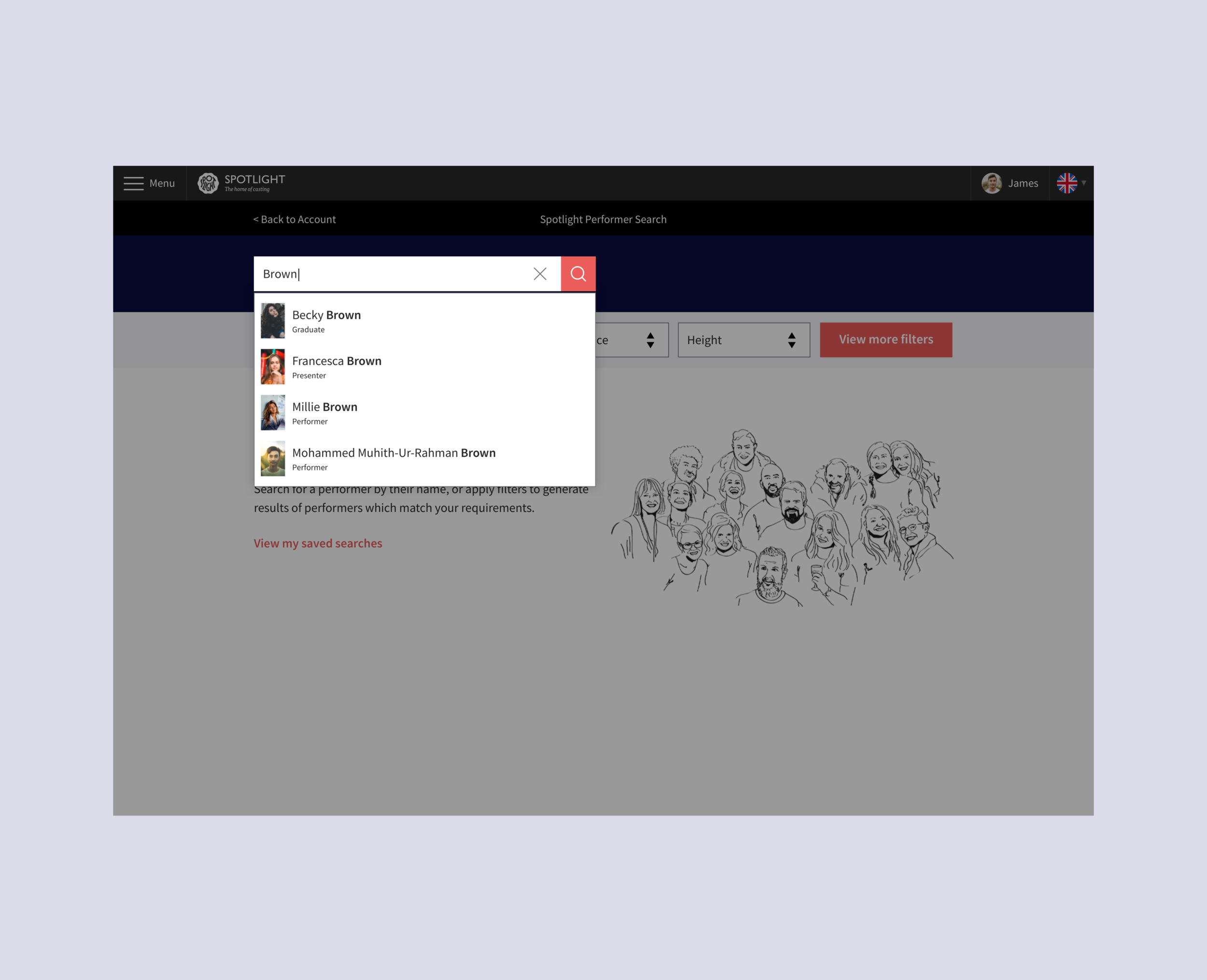
Search bar, autocomplete, top level filters, sorting by, results overview, performer cards, quick view, load more / pagination.
Membership workshop — engaging stakeholders.
Membership workshop — discussion points and feature mapping.
Casting professionals survey
I sent a detailed survey to casting professionals to gain insights into their frustrations, needs and preferences when searching and filtering for performers.
Key insights included:
Casting directors wanted ability to search for query terms.
80% of casting directors want to sort performers by A-Z.
89% of casting directors want to filter performers by their location.
66% of casting directors ranked ‘add to shortlist’ as their primary action.
Technical validation sessions
These sessions with stakeholders helped align decisions for various components with our technical capabilities and also our capacity to deliver.
Key decisions included:
Search logic: Auto-update search scope based on category path unachievable.
Results logic: If searching in wrong category, user being switched if prominent results are in another was unachievable.
Results logic: Auto-correct misspellings unachievable.
Ideating the solution
I used low-fidelity wireframe sketches to work through initial ideas and then carried out preliminary validation with platform users, using more refined versions. The feedback helped make design decisions, before creating interactive prototypes, using existing basic components to iterate quickly.
Very rough sketching example of key mobile screens.
Very rough desktop wireframe sketching.
Low-fidelity interactive Atomic desktop prototype.
Usability testing
Testing scenario
We tested desktop and mobile prototypes on-site with casting professionals, including the BBC and Andy Pryor Casting. Prototypes allowed fluidity in pathways and allowed searching dynamically.
Users were looking to cast a lead performer with certain characteristics — like they would usually.
Search for performers with multiple characteristics.
View quick view, full profile and add to shortlist.
Testing goals
Understand users preference for finding performers with certain characteristics — search bar vs filters.
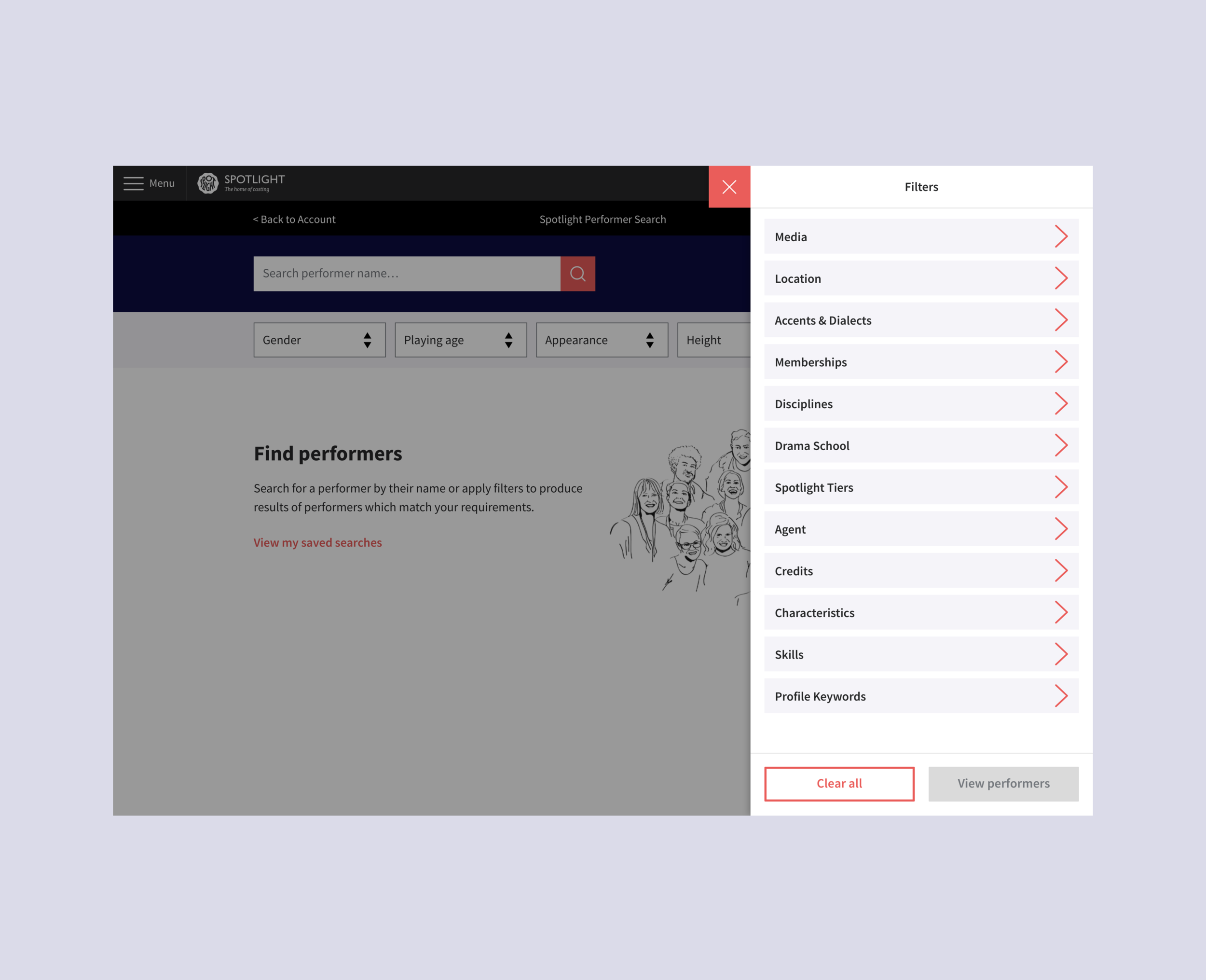
Validate proposal of primary filters exposed by default and all other filters within hidden drawer.
Validate users comfortable with interactions including selecting and removing filters.
Gain insights into user behaviour when filtering for performers and viewing more performer details.
On-site testing sessions with casting professionals.
User testing sessions with the BBC.
Key insights
100% of casting directors currently use polyphoto view and liked new optimised grid view of performers.
100% of users navigated through test journey easily and understood filter interactions.
100% of users looked for first characteristic in filters rather than search query bar — they would only search names / production keywords there.
Considerations
Users confused by initial performers shown by default.
Users don’t want initial results randomised by default, instead wanting clear defined order.
Majority of casting directors not interested in search with AI.
Users were not interested in seeing which performers are “New to Spotlight” and saw no benefit.
Production design
The new performer search addresses various issues faced by casting professionals. This proved a challenge, as a complete overhaul would potentially alienate users.
With validated design, architecture and logic decisions made — the result is a simplistic and responsive tool which redefines the way users can locate filter facets and perform tasks. The redesign prioritises accessibility, making the transition seamless — streamlining and accelerating the search process and key actions.


Establishing patterns
Whilst designing performer search, I also worked on improving other key touchpoints of Spotlight’s platform. These included casting projects (job listings), breakdowns, shortlists and client lists. These areas would be able to follow similar principles and UX patterns as performer search for searching, filtering and viewing results, and re-use components.
Product features
The performer search tool focuses on making actions intuitive. We prioritised accessibility through stripped back UI to focus on making those key interactions simple, using newly formed items from the evolving design system whilst designing new components and further defining styles.
Simple search
We retained simple search functionality to focus on name matches, instead of the complexity of characteristics.
Interactive filtering
We restructured and mapped all filter categories, aligning them with the correct functional UX patterns.
Sorting results
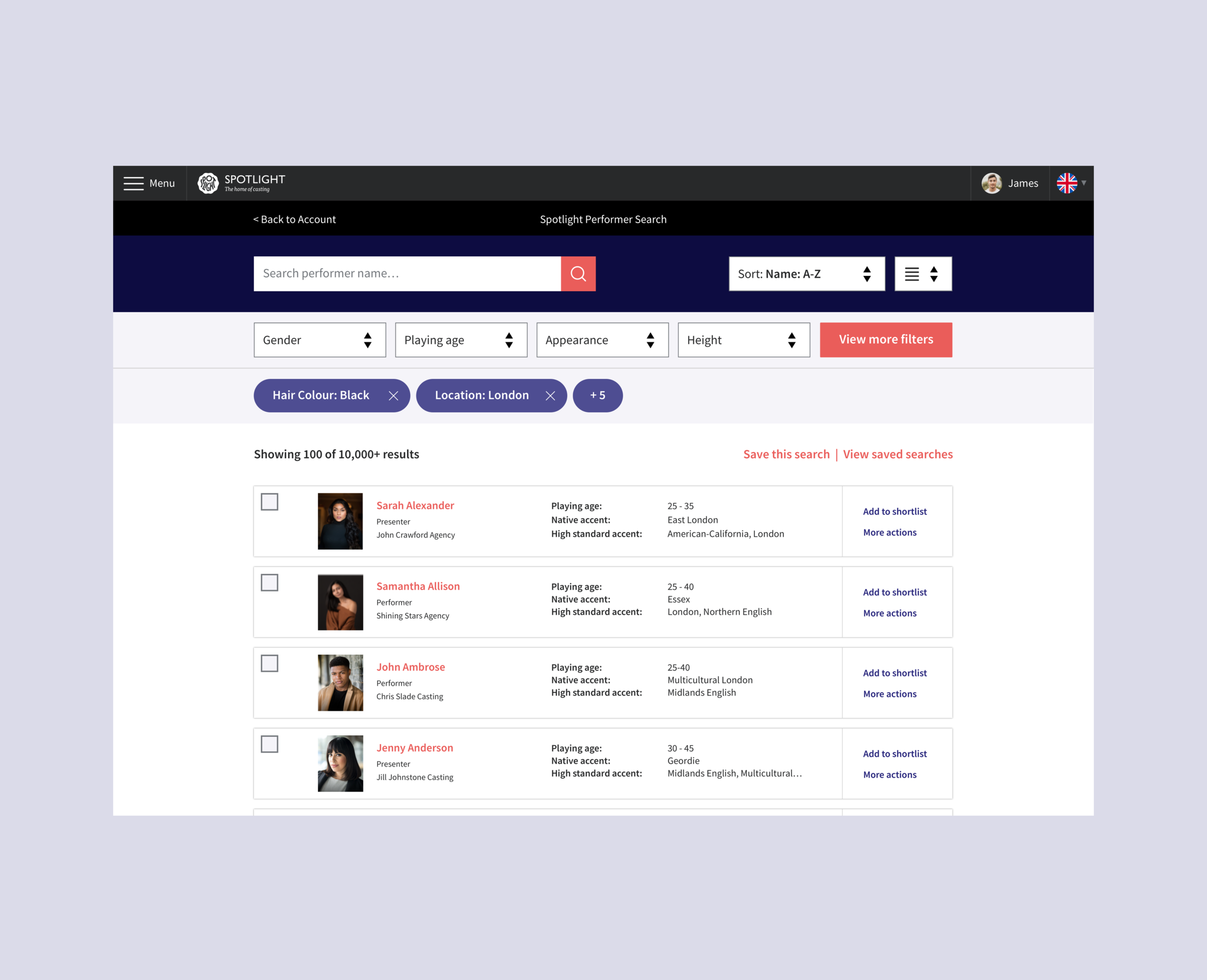
Introducing new sorting options for users, to allow flexibility and clarity when organising results.
Performer cards
Performer cards were optimised with headshot size, and include multiple target buttons for different actions.
Quick view
Quick view allows users to access a snapshot of key information, whilst browsing and shortlisting talent.
Intuitive actions
Add to shortlist is prioritised on performer cards, as all action journeys are clear for users to complete tasks easily.
Mobile responsive
Performer search was optimised for mobile web at last allowing casting professionals to perform search in all environments. Incredibly, many users had been struggling through important search tasks using the unresponsive tool on their smartphones.
Final thoughts
Enjoyable project with challenges
I was able to learn about casting and the performing arts industry, and understand the issues casting directors and agents faced. There were challenges including timelines, internal resource, and designing a tool which would reinvent the ways of working for a user base where many hated the idea of change.
New intuitive performer search
The new Spotlight performer search optimises and modernises essential daily tasks for casting professionals — a result of research, ideation, testing and clean design which engaged stakeholders and defined process for more platform improvements.
Design system foundations
Whilst working on performer search and other deliverables including profiles, job listing journeys, shortlists and contacts — the foundations of a design system were being built, with the ambition to grow Spotlight and improve internally.
A special shout out to:
Heather Quinn, Regan Andrew, the membership team and the wider product team.


