Designing a new web platform for 40m+ users to live stream their favourite sports, browse the latest news and see results
8 min read
Client: Eurosport
Sector: Sport / Broadcast Media
Role: Lead Experience Designer
Duration: 1 year
Completed: 2020
Overview:
Eurosport is the number one sports news website in Europe with an average of 42 million users per month. I lead UX within Eurosport’s web product team whilst redesigning their website, and collaborated with the app team. My role involved strategy, research, discovery, information architecture, prototyping, wireframes, user testing and UX/UI design.
The challenge
Having launched Eurosport Player, the focus shifted to redesigning Eurosport’s website and app. The objective was to create a single destination to access both free content and premium content with a streamlined registration.
Eurosport’s suite of direct-to-consumer digital products had become disjointed and past deliveries had lacked user-centric design principles. There was a clear opportunity to deliver vast UX improvements and develop new product features.
Project goals
Goals included:
Creating a product to delight customers and address their desire to search and browse realtime sport scores, news and videos.
To unify premium subscription site (Eurosport Player) with the free site (Eurosport.com) to offer a single destination.
Introduce 3 visitor status: Guest, Registered and Subscribed.
Rebuild trust in Eurosport’s products.
Focus on customer experience to drive long term revenue.
Prioritise customers ability to access content most relevant to them.
Research and discovery
Our UXD team worked with autonomy to determine an approach, proceeding with a discovery phase through workshops and other research methods to understand the problems.
Kick off workshops
We conducted 2 days of initial workshops, discussing early assumptions, mapping high level journeys, looking at potential opportunities and exploring ideas for features.
Surveys and interviews
Previous surveys had been conducted with sport fans to look at the differences in preferences and behaviour. Our team followed up by conducting user interviews to gather more data.
Data and analytics
We looked at website traffic, pathways and click data and watched recordings highlighting actions and scroll depth. Our goal was to identify initial signs of user frustrations.
Benchmarking
We looked at products across markets, including Sky Sports, BBC Sport, ESPN and L’Equipe, and we looked at editorial best practices too such as the Guardian, NY Times and Bloomberg.
Kick off workshop with UXD team.

Affinity mapping research themes and opportunities.
Key themes
Through our discovery, research themes started to present themselves. Early business requirements were validated as we started to see where the opportunities were to create a better experience for our users.
VOD & live video
On demand videos and live streaming of sports events — a single destination for all content types reflects user needs.
Personalisation
Users want to see content relevant to them with control for what they see, as accounts lacked these preferences.
Match & game centre
Users want quick access to live data and scores, as there was opportunity to make significant feature improvements.
Differentiation
There was a need to portray a different tone of voice and angle compared to competitors, with content and coverage.
Finding content
Users want to access content easily and have visibility of live events, though rigid guidelines existed for publishing content.
UX improvements
Eurosport’s site structure had become dated and various areas would need to be improved to become a better experience.
Definition phase
Following our research, we set out to define the problems to address. Our intention was to filter our findings and output into the product directors and product managers, influencing requirements and the project roadmap for both responsive web and app.

User personas
We built new personas to understand user motivations to help with improving IA and solutions for finding content.

Problem statements
Key themes helped us to define problem statements, as we started to map ideas for potential features.

Information architecture
We redesigned our website and app IA, as we ran tree testing to validate decisions and changes to structure.

Gathering requirements
We ran workshops with key stakeholders to gather requirements, using our research to drive new features.

Further workshops
We continued to run workshops with product directors and stakeholders, looking at jobs to be done for users.

Exploring journeys
We explored journeys such as onboarding, setting favourites and viewing latest news across both app and web.
Redesigning the website
The product team’s focus shifted to the redesign project. Our UXD team grew in size to fulfil the demands of redesigning an app and website, and designing a website for the Tokyo 2020 Olympics.
As roadmaps were finalised within the business, new product pillars were defined: App, Web, Features & Components, and Olympics.
I had the opportunity to lead the experience design in the Web team, redesigning fundamental parts of Eurosport’s website. This responsibility would require close collaboration the App team, as deliverables would share principles, logic and UX rules.

Eurosport’s previous desktop home page.
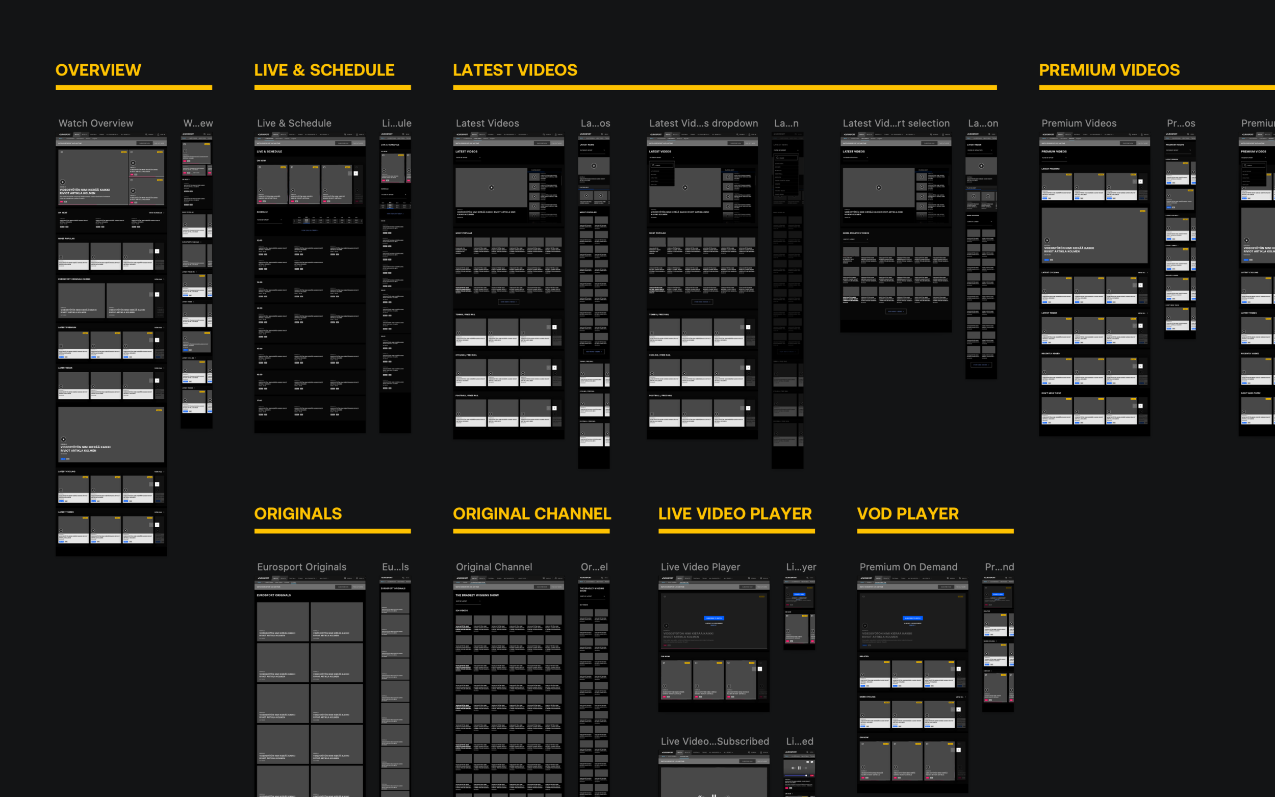
Objects and components
To kick start redesigning the website experience, we decided to follow principles from object oriented UX — organising objects over actions to help improve architecture, define the types of content we have across the site and create first draft visual references of components needed.
I began to map all content types and associate each with a component across responsive web sizes, including variants of each component. At this point I began to establish fundamental rules for content types, such as only allowing video or long read article content to adopt rail formats.

Component mapping — early wireframe variants.

Overview of refined UX work mapping component types and variations.
Key component types
When defining our content types and designing components at wireframe level, we made sure to clearly differentiate between them. This would allow users to quickly identify articles, live videos, replays, podcasts etc.

Editorial components
Editorial content consisted of articles, articles which contain videos, long read articles and podcasts.

Video components
Includes on demand videos (either free news or premium replays & highlights) and live premium videos.

Sport data components
Sport data encompasses entry points to match and event blogs across sports, and tables, results and standings.
Article pages
Recirculation of content
We knew that discovering content was an issue. The first touchpoint to address was articles — our highest traffic pages. A good first impression was key, as many users came from search engine sites. We improved page structure and focussed on recirculation of related content and promoting premium videos and live events.
Editorial flexibility
One of the issues we discovered was the lack of creativity the editorial team had when publishing articles for different scenarios. We introduced new component modules and interactive ways to engage users such as video playlists, polls, emphasised quotes and photo slideshows.
Optimised UX wireframes and new features.
Match centres
Sport specific architecture
The experience lacked innovative features, alerts and personalisation which other products in the market offer, as sports often had incorrect labels and terminology. We started to document which sports shared principles of being team format (scores), head to head (set scores) format or race (time/distance) format, to then improve architecture.

Mapping content per sport and competition.
User flows exploration for match centre scenarios.
Phased feature opportunities
Working closely with sport data stakeholders, we established match centre components across sports. Having improved architecture and identified better specific data to present for each match centre template, the ambition was to evolve features through phased future releases.
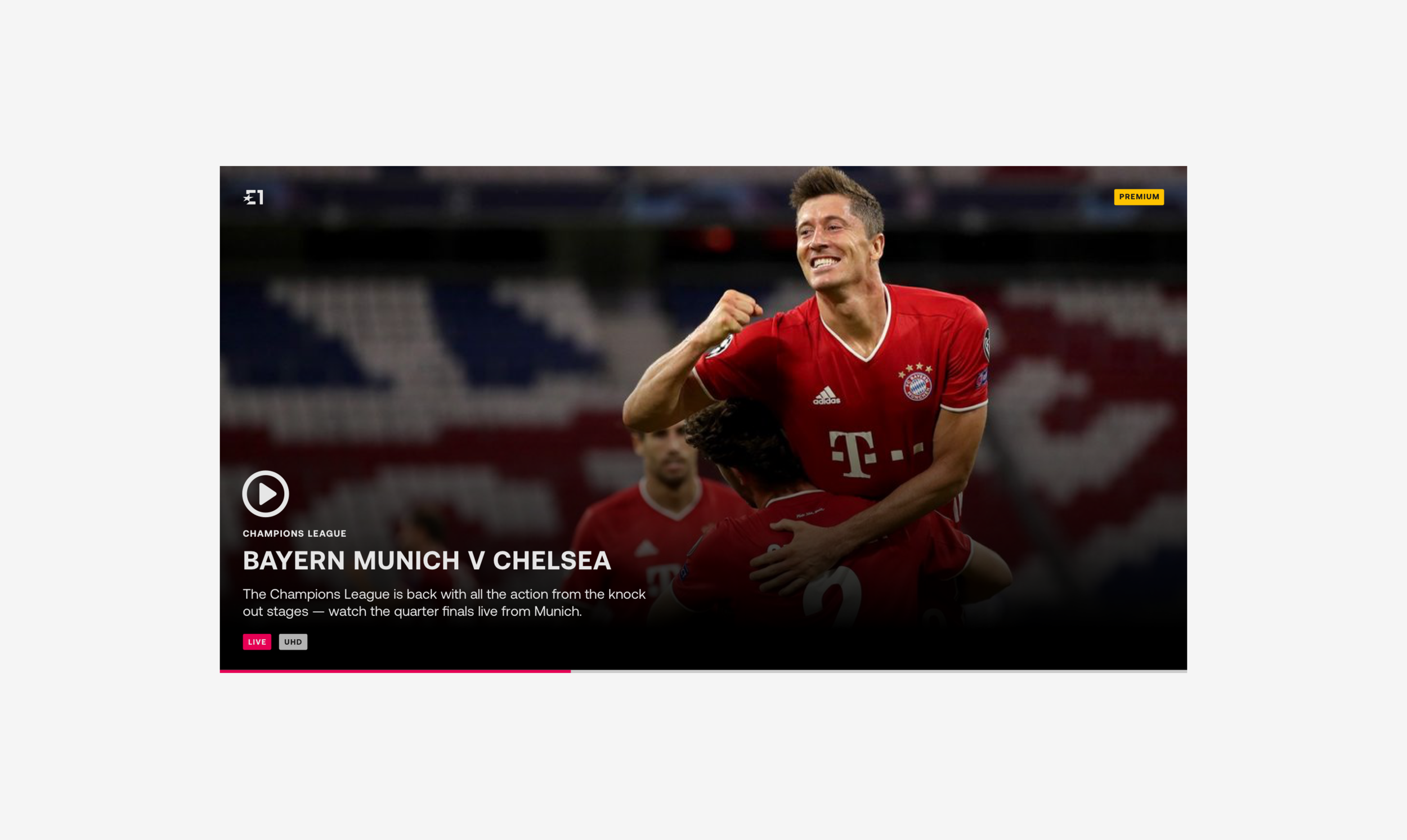
Watch section
Watch your favourite sports
A huge part of the project was to bring premium content from the Eurosport Player into the free dot com experience, as I was tasked with designing the new section Watch. I quickly looked to establish UX patterns using the components we had defined previously. Challenges included technical feasibility and logic, as search was deemed out of scope.
Example of wireframes delivered for new watch section.
User testing insights
We ran testing sessions to validate the approach for Watch. We quickly discovered key insights into users mental model for searching and browsing, which would influence the iterative changes we would make.
Proposed changes included:
Strong messaging for subscription and what premium means.
Video duration labelling clearer and position prominent.
Live page and Schedule page become ‘Live & Schedule’.
Page filters - evidence suggested users would look to go to the video content type first, then to the Sport by filtering or ideally searching.
Latest news - redesign page to lead with video player playlist.
UX changes would need to be phased based on project delivery timelines.
Insights included:
Term for Short videos: users unclear over this content type.
Term for Premium videos: users unsure on access they have.
Term for Competition videos: competition not generic and too specific to some sports, as some users were confused.
Users mental model is to find videos via content type first.
Sport as nav item lost on mobile due to scroll / visibility.
Filters would help users find content easily or give access to sport categories.
Duration is key to user’s motivations for watching content.
Home page
Redefined editorial flow
The challenge was to deliver a home page allowing users to discover content easily which fits within the current editorial publication logic. I worked closely with the editorial team across Europe to define a structure which fits processes, but gives new opportunities to promote content types (articles, on demand videos, live videos, podcasts, sport matches) in flexible ways.
Clear content types
The new page UX structure has an editorial planner of content organised and published by editors, with automated video rails (live, premium and free) injected throughout, and fixed editorial modules to promote themes or grouped content. The card anatomy defined in our component UX work allows users to digest items clearly.
Blended taxonomy
Eurosport’s home structure focussed on the grouping of content by sport or competition. With the redesign, we gave editors flexibility to link items of the same topic, but created a blended taxonomy approach — giving every item prominence and allowing users to discover the vast content.
Exploring specific scenarios
Part of the redesign looked at redefining structure and hierarchy rules across states and moments, such as pre events, during events with live content, post events, multiple events of importance occurring simultaneously, and when headline news breaks. Opportunities to define further would happen in future releases.
Home page UX delivered after many iterations.
Annotations for defined editorial logic and components.
Hub sections
Mapping use cases across different tier sports.
Tiers and scenarios
The fundamental improvement was to promote our wide range of content with newly established patterns. These would differ across territories between our top tier sports with premium content and our lower tier sports. We looked to define key scenarios, where the emphasis of content would change in the page hierarchy.
Specific navigations
Another improvement was to define better sub navigation architecture per sport. Previously, various sports and competitions lacked terminology and sections which were specific to the sport. We also looked to define new sections to promote data that users want access to quickly such as tables, fixtures and rankings.
Design phase
Eurosport rebrand
During the website redesign, the business decided to rebrand Eurosport. This was an exciting opportunity to influence the output. I was able to join sessions with RGA to help define the digital-first rebrand, and work closely with our team building a digital style guide and design system.
Component design
Following the UX component mapping, our design team began crafting components, using the opportunity to evolve the brand and explore design language. I was able to collaborate and help shape an exciting new identity with components to use across multi-digital channels.

Examples of UI components crafted for Eurosport’s website.
Digital style guide to design system
Whilst my primary focus continued with key UX deliverables and designing product features for Eurosport’s single destination website, our team were drafting a digital brand guidelines and were building the foundations of a design system. Throughout this, I worked collaboratively in validating approach and components.

Digital style guide draft documenting the new brand, including typographic scales and colour etc.
Eurosport’s new website
Eurosport’s new website improves key sections, introduces various new features and makes fundamental user-centric changes to the experience, setting the foundation for growth and continuous future releases.
I was able to lead UX for the web launch of Eurosport.com, covering 75 countries. Through research, workshops, prototyping, usability testing and design, I helped to deliver a new platform and rebrand.


Next steps
⏳ Phase two+ product releases
⏳ Building more product features
⏳ Developing a test-driven culture
⏳ Design system for greater efficiency
A special shout out to:
Teshan Luchmun, Raffaella Garavini, Steve Cockett, Claire Hughes, Gaia Bertolotto, Rory Pyatt, James Kelly, Alex Koutsoupas, Mike Brown, Alex Brown, Aarohi Jain, Steve Boulton, Tim Orme and the wider product team.